I’m an advocate for Descript as a tool that can radically democratise podcasting, and put the medium’s unparalleled powers into the hands of those who don’t get their kicks looking at waveforms.
My previous product had an Export button within the Descript interface. I regularly teach how to use the software, and earlier this year I released my own self-paced course. I’m an experienced audio editor and a software engineer, so I’m in a pretty good position to appraise the new version of Descript. And I have some concerns.
They mainly focus on the user interface and interactions, but there are also some bugs – some longstanding ones – that need to be discussed. It’s not all dour though, so I’ll start off with what I do like.
User interface design

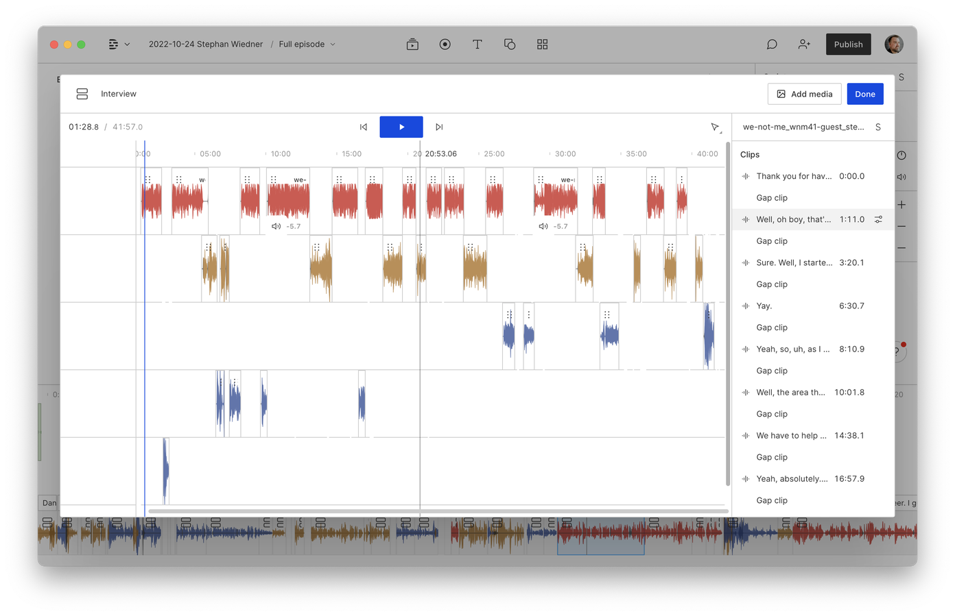
Firstly, I like that editing sequences is modal. I edit sequences to remove cross-talk and headphone bleed before jumping into a content edit. Previously zipping back and forth between the transcript and the more traditional DAW-like sequence interface felt a bit clunky, so this is welcome.

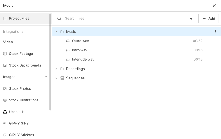
The Media Library is its own semi-discrete quasi-window. This should probably go back to a permanent left-hand pane where it was before, so that media can be quickly and easily dragged onto the timeline. Being able to import media from Unsplash is handy, but it’s an edge case that doesn’t justify hiding the real assets a project needs.
That said, I do like that I can easily see which media I’ve used in a project, and which I haven’t, via a little indicator.
But this modal box gets us into another issue with the new design. Everything now has a flat white background with no depth or shade, which makes it much harder to distinguish one part of the interface from another. Gaps we’ve inserted between segments are harder to spot. There’s little to delineate the speech track from the music tracks, and no sense of hierarchy.

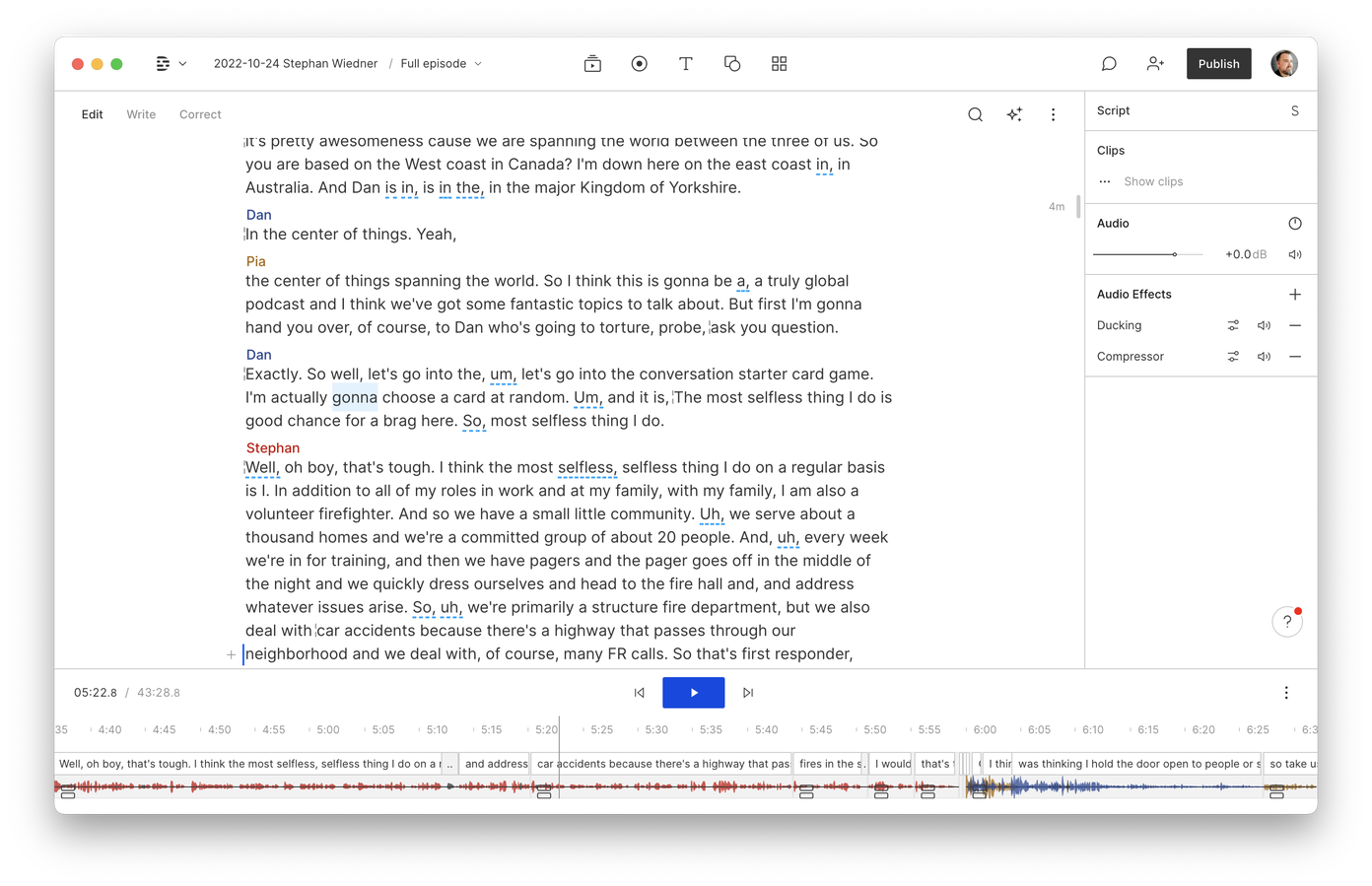
The script is also cramped and really ugly. The speakers’ names appears on one line with the text underneath, with very little break between the two. I don’t have an overly-large monitor and you can see I’ve got plenty of space to put the speaker labels on a left-hand column… especially now they’ve done away with the sidebar.
Also the timecode has disappeared from the top of the window. This is part of a larger trend led by Apple (even though this is cross-platform software), which seeks to hide everything the designer feels isn’t essential.
I’d like the designers to have a little audio editing experience before making unilateral decisions about what’s important to put in an interface and what can be left out. Knowing where you are in time is important. It’s also crucial when you’re adding markers for things like dynamic ad insertion. (Yes, I know there’s a timecode at the bottom-left of the screen. Great. Now put it back where it was. 😉)
OK, so that’s mostly the look of the thing. Now let’s get into some of the interaction concerns I have. But again, I’ll start with the positives.
Interaction

Zipping around the horizontal timeline is way smoother. The developers have clearly done tonnes of work on that part of the underlying UI code, and it shows.
My iMac is four years old and would occasionally get a little stuck as I swiped horizontally through a sequence or picked up a piece of music to make a precision edit. So this is a welcome improvement to a piece of software that is already bursting with technological prowess.
You used to be able to start and stop playback with the Tab key. That’s important because in a text-based editor, you need to distinguish between placing a space character somewhere, and playing or pausing audio. Now, only the spacebar starts and stops playback, which regularly causes confusion.
The previous way of hand-correcting the transcript was to hold down the E key on a bit of incorrect speech, and make your changes. Now we have to choose whether we want to be in editing mode, writing mode, or correcting mode. (I’ve been using Descript since 2020 and I don’t know what “write” mode is.)
The mode you’re in is not obvious because, again, the designers felt that showing these options on-screen wasn’t important, and that presumably users would just know to hover over the Edit label (which is apparently a button? Thanks flat design) and choose another mode.
Just as Apple needed to be calmed down when it got a bit overexubernt making everything thin and flat, I’m sure Descript’s designers can chill out on the monochrome in a future release. This is all very fixable.
I can also accept that some of this is just a new paradigm I’ll need to get used to. Stuff changes, and the intent is always to make software better, easier to use, faster to get stuff done, etc. People don’t usually rush into changes; they take the time to test what works, and that’s why we have a beta cycle. So I’m not upset so much that there’s a new interaction, but that it’s fundamentally confusing and difficult to know which mode you’re in. And stuff is being deliberately hidden from the user to make it prettier, when there’s more than enough space.
Something I now have to watch out for is whether the Play button is blue or not. When it’s blue, that means you I hit the spacebar to play audio. When it’s not blue and I hit the spacebar, that means I’m editing text and I have to hit Esc to get out of text-editing mode. This is probably with the intent of making corrections faster. All it does is make the interface inconsistent and harder to predict.
And again, because everything’s hidden behind disclosure buttons, applying effects and making changes to export settings takes exactly one more click than it used to, per effect. Those clicks add up when you’re producing multiple podcast episodes a day.
Bugs
What I’ve mentioned so far are systemic problems that will need addressing before I can continue to recommend Descript. But there are some new bugs that I should probably make the team aware of, that if they aren’t already on their roadmap to fix, should be.
The timeline forgets where you are if you make an adjustment, to – for example – close a gap between words. When you hit Play again, you’ll be jumped back to the previous edit, which could be seconds or minutes from where you were. Currently the way to counteract this is to click in the part of the timeline where you place the music, as this seems to get the UI to place the playhead correctly. If you forget to do that, it’s maddening.
Capitalisation with the Q key doesn’t work. Sometimes Descript will mis-capitalise a word, and it’s far easier to hover over the word and hit Q than it is to go into correction mode, type the correction, and then hit Play again. Please put that back.
Re-joining a split edit doesn’t work. It just says there’s “no media”. If you use filler word removal – which I don’t even know where to find in this new snowy tundra of an interface – then you’ll need this to finesse some of Descript’s more clumsy edits.
Music gets cut off at the end when there isn’t speech for it to play underneath. You can adjust it again but you have to remember to do that.

My biggest concern of all
There are longstanding bugs with transcription that haven’t been addressed. It’s common for several words within a document to not be transcribed. Usually these are at the end of sentences, although not always, and there’s no heuristic I can figure out as to why… it’s not because the words are shorter or quieter.
It used to be a little easier to bail out the transcription engine and make these hand-corrections, but now that correcting text whilst editing takes longer and feels fiddlier, I’m less inclined to land a hand. That makes my transcripts less usable to people with hearing impairments.
Transcription still gets out-of-sync with the audio sometimes. So if you edit out a word, you can find yourself inadvertently cutting out half of another word, because the timing’s off.
I’ve brought these sorts of issues up before but have never had a satisfactory answer as to when they’ll be fixed.
And sometimes Descript just hears a word that does not exist in the recording, and there’s little you can do to tell it otherwise. A second after you remove the word, it just pops back up again. It’s rare, but when you edit as many episodes as I do, these edge cases add up.
I know what it’s like to be a software engineer. I also know what it’s like to work under project managers. At some point someone gets excited about implementing a new feature, or working on something that’ll open up a new market. It’s natural to get excited and want to chase the new thing. But if you’re working on a house, you surely want to address the mould that’s crawling up the walls before you tack on that conservatory?
Final thoughts
I’m as frustrated as I am because I think Descript is a wonderful tool. It lets me offer great value to my podcast editing clients, and it gives my DIY students a tool they can wrap their heads around.
I love that I can share an edit for approval without having to upload anything. I just publish the project to the web and embed the Descript player in my Notion workspace, where I collaborate with clients.
I love that my clients get a transcript with each episode I edit for them. And that I can search back through the document to find mentions of words or phrases they want removed.
I love that Studio Sound gives us one-click access to powerful tools that improve audio quality and bring people closer to the mic by eliminating reverb.
I love that I can quickly and efficiently produce consistently-good content, giving my clients a better service for less money.
Descript is a critical part of my workflow. It’s a professional tool, not a toy. I just wish the team would think more carefully about the changes they make, especially when they’re this disruptive.
I can go back to editing in Logic or Audition as I have done for the last 20 years. But right now we have something that doesn’t bring with it a steep learning curve – something that feels intuitive, like you almost already knew how to use it. If this new version of Descript sticks and we lose what they’re now calling “classic mode”, I’m worried that audio editing will go back to feeling far more like sorcery than it should. That means more people using inferior web-based tools, making less-considered audio, and putting their listeners at a distance.

Add your response