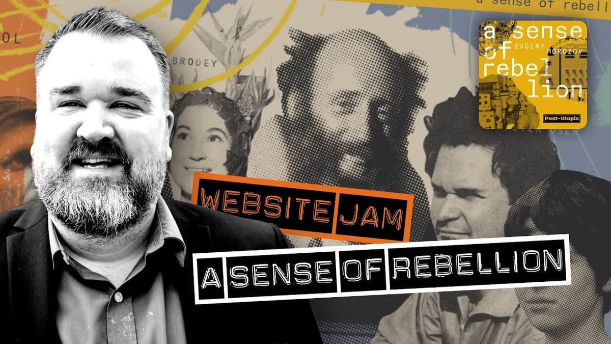
`This is a standout podcast website, just like we used to make, and it makes me so proud. It's for a podcast called A Sense of Rebellion.
The first thing you notice is that this is not a cookie-cutter website. There's striking imagery, and so much work has gone into the art here. You can jump straight into the trailer, and they've done a great job giving you a video trailer for an audio-first show.
There's some context, a little info about the show, and lots of rich text, imagery and video to dive into. The site feels like flipping through an exhibition catalog. It’s beautiful and interesting, and so well-considered.
On mobile, everything is equally well thought out, although it can get text-heavy. I don't love the monospaced font for lots of text, so would love to have seen something like Helvetica, which would match the aesthetic without being too hard to read.
The goal of the homepage is to get people to listen to the trailer and then follow the show in their app of choice. That’s where it falls down a bit, as there are buttons at the top of the page, but they aren't very obvious. I thought they were share buttons at first, but they’re calls-to-action to subscribe to the show. They needed to be further down, just after the trailer, and much more obvious.
If you like to offer lots of show notes and jumping-off points for your listener, this kind of site lets people dive deep and get lost in your work.
Great podcast websites aren’t just about promoting the show or SEO (SEO is dead). It's about wowing someone and drawing them in.
What podcast website should I review next? Let me know in the comments. 👇
